by Jackie Bultje | May 14, 2019 | fancy fold, Father's Day, masculine cards, twisted pop-up card |
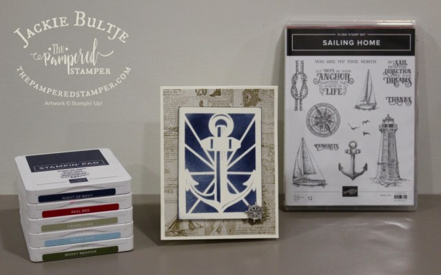
Hello stampers. My most popular video on YouTube is a twisted pop-up card tutorial but it is already a few years old so I thought it was high time to make another one. Meet my Sailing Home Twisted Pop-Up card. This is such an impressive technique card and when you are shown the proper way of doing it, it really isn’t that difficult. The outside of the card looks completely normal, the surprise happens when you open the card. The effect is very satisfying to you the card maker! I decided to use Sailing Home because I love the suite so much. Let’s first take a look at the mechanics of this card.

After you have your standard card base of 4 1/4″ by 11″ scored at 5 1/2″, you will need this piece. In the video tutorial I will show you how to fold it. Basically the two triangles you see in the diagram stay intact. You fold it in half down the long scoreline in the middle, and then you tuck the middle in behind the triangle. Clear as mud? No worries, in the video it will make sense. If you take a look at the next diagram you will see the shape it needs to be. Before adhering this to the inside, I adhered two 4″ squares of designer series paper to the top and bottom inside of the card.

Once this first piece is inside you are ready to also adhere to the bottom of the inside of the card (the triangle you see will have sturdy adhesive put on it and then you close the card so that it will stick to the bottom as well)

This part will become the focal point of the Sailing Home twisted pop-up card. It is easiest to completely decorate this part before putting it inside the card. For this stage of the card a video is the easiest way to show the procedure. A twisted pop-up card is very difficult to photograph, so I decided to pin it to my card “clothesline” so you could see it properly. First we will take a look at the very ordinary front of the card. I did use one of the gorgeous laser cut pieces from the Sailing Home Memories and More card pack to use as a stencil and I am really happy with how it turned out.
I have to confess that I went for a walk with my girls after supper and when I was almost home I remembered that I had invited people over for a visit!!! They were waiting for me when I got home, so I ended up taking these pictures in “night” light, not natural light, but they aren’t too bad.

I love how these papers and stamps just work so well together. I used night of navy, mossy meadow, real red, crumb cake and balmy blue.

Here you can see all the stamps and framelits I used for the inside of this card. I can’t wait to make another one of these with a different combination of patterned papers. I did use the water stamp from High Tide on the first and last panel. You could also stamp the sailboats in memento ink and use Blends to colour them for a stepped-up version of this card. Here is a very short video that shows you the card “in action”. Tomorrow I hope to do a lengthier video tutorial on how to make this card from scratch.
http://https://www.youtube.com/watch?v=ylMUySgG8gs
Thanks so much for stopping by today. I promise I will share the video tutorial on my next blog post. In the meantime, you can check out my original video here and that should help you get started on your very own Twisted Pop-Up card. I would love to hear how you make out. If you really love this bundle and can’t wait until June 4, you can add it to a starter kit right now. If you live in Canada, just click here to make that happen.
Product List
by Jackie Bultje | May 13, 2019 | Father's Day, home decor, home decor frame inserts, sampler, Uncategorized |
Hello stampers, I’m back after a busy weekend. Not only was it Mother’s Day, it was also my daughter Rachel’s 20th birthday! So we had a weekend of celebrations with the family which was really, really nice. The weather even cooperated on Saturday with some nice sunshine. Today it is raining again, I swear even I am going to start growing moss! Today I want to share with you some more home decor frame inserts. In the winter we made this home decor frame for the first time with the promise that more inserts would be made as we needed them. This is such a nice easy project to do and to change up for the different seasons. If you look at this blog post you will see the original. Here are the latest additions:

I made two different floral ones for spring and the reason for that is that one is using a framelit and the other is fussy cutting, so there is a suitable option for different crafters. I also realize that my summer insert with the leaf and chair does look a little bit like fall. It is just that I love red and also love the real red and crushed curry together. I might have to make a different summer insert, but do you think this is a good one for Canada Day? The apron with the barbecue tools is also a favourite of mine. Do you want to see what they look like in a frame?

The daffodils in this frame were fussy cut and they come from the stamp set You’re Inspiring. I coloured with Blends and added a few pearls. The frame comes from Michael’s from their everyday value collection so it is almost always in stock and only costs $10 in Canada.

The flowers here come from Lovely Romance which is now sold out, but at least you can use this easy version in my class if you don’t want to fussy cut the daffodils!

Here is a close up of the barbecue apron and tools which I made using Apron of Love. This set is also retiring so get it before it’s gone. It is perfect for scrapbooking and also for mother’s day or father’s day cards.

The paper for the apron comes from Best Route and the strawberry is from the retired set Fruit Basket. The fruit punches are on the clearance rack right now! The galvanized metallic paper was on the clearance rack for a super deal so I scooped up several packages. It’s always a good idea to keep an eye out on the clearance rack. There are super deals, but it is like Costco, if you see it you need to get it right away or you will miss out.

I think this last one is perfect for Canada Day although you could definitely use it for fall as well. The red leaf is symbolic of our solid red maple leaf on the Canadian flag. I might have to make a beachy scene yet to appease my summer lovers. I don’t know if we have a current set that has a sand bucket, but I am going to use the set Beach Happy and see how that turns out. Did you know that it is retiring too? If you want to add any of these retiring products to your collection and you live in Canada, just click on the images below and you can start shopping with me. I will be even happier if you also use the current host code TXE4JNCY.
Thanks so much for stopping by. Have fun making this super easy home decor project. This makes a fun and memorable gift for your friends as well.
Product List
by Jackie Bultje | May 10, 2019 | art, Blends, crafting forever, framed art sampler, half full, shimmery white cardstock, wine |
Hello stampers! Framed samplers are so much fun to make and to display, but this Crafting Forever one is ideal for your craft room if you are lucky enough to have one. You could also make it as a gift for your favourite crafty person. I made it specifically as a thank you for all my club members. They make a commitment to meet five times a year to make cards with me and place orders and I think that deserves a reward. Lasting friendships are made through my clubs and that is the very best part for me too. I always tell “my people” that attending classes is the best thing that they can do for their hobby because it ensures that they use the things they buy. When you go to classes you are inspired to create. You learn new things and that motivates you to put your knowledge into practice and to share what you love with others. Homemade gifts never go out of style. Shall we take a look at this beauty?

This sampler measures 8″ by 10″. I might tweak it a little bit yet and I always encourage my class attendees to feel free to make it their own by adding or changing the embellishments or anything else they with to change. I think I will add a little bling to the top left square. You could also choose to colour in the cafe image on the bottom left rectangle. Everything was stamped on whisper white and matted with basic black. I used an assortment of Blends to colour my images. There is a LOT of fussy cutting. The only truly fussy one was the clay pot with the brushes. The wine glasses were stamped on shimmery white cardstock which makes them look more like glass. They are a different shade of white so they pop off the white background subtly. I bought the frame at Michael’s, it is part of their everyday value collection, so it was only $12 in Canada.

I thought I would show you what it looks like outside of the frame so that you can properly place your elements on the 8″ by 10″ white insert. Would you like some measurements?
wine and scissors rectangles: 5 1/2″ by 2″ (white) 5 3/4″ by 2 1/2″ (black) each
spools: 2 5/8″ by 2″ (white) 2 7/8″ by 2 1/4″ (black)
Crafting and pens: 2 1/2″ by 2 1/4″ (white) each, 2 3/4″ by 2 1/2″ (black) each
get creative- 2 1/4″ by 4 5/8″ (white) 2 1/2″ by 4 7/8″ (black)
You can adapt this to your favourite colour scheme. For a complete list of products that I used, just scroll down. I was inspired by Chris Galbraith, you can find her sampler here.
I used an aqua painter to make a swoosh of smoky slate under the clay pot of brushes. SInce I was using regular whisper white cardstock I had to just make a quick swoosh. You do not want to add a lot of water to this paper or it will disintegrate. It might have been a better choice to just stick with Blends. You can see from the picture that some of the elements are popped up to add visual interest. I used the little background dots from Timeless Textures to add some interest to the scissors rectangle. I first stamped them in smoky slate (second generation stamping which is the new way of saying “stamped off”) I also used second generation stamping in daffodil delight and berry burst. I wanted to add some berry burst to the stamped images to tie in the berry burst metallic edged ribbon. This gorgeous ribbon is retiring, so get it before it’s gone!
Thanks so much for stopping by today, I hope you enjoyed this post. Happy stamping!
Product List

Daffodil Delight Classic Stampin’ Pad
[126944]
$8.50
by Jackie Bultje | May 9, 2019 | anniversary, Bird Ballad Suite, designer series paper, laser-cut cards |
Hello stampers. I think that one of the first things you will fall in love with when you see the new catalogue is the Bird Ballad Suite. It is chock full of pretty, pretty things. Those birds are just so stinkin’ adorable. Then we have the stamp set, the stitched nested framelits, the designer series paper, the scalloped lace trim, bird ballad trinkets and to top it all off, the Bird Ballad laser-cut cards and tin. Is your head spinning yet? You can buy the entire suite with just one number and one price. $128.75 will get your everything. Oh the joy!
I was asked to make an anniversary card for a dear friend and I knew that she loved this suite so this is what I came up with. I can share it now because it was her anniversary yesterday. It is actually a very simple card to make and it really lets the lace shine through and be the star. Let’s take a look.

I fussy cut the birds from the Bird Ballad designer series paper. What I really love about the designer series paper matching the stamp set so well is that I can use it as a guide when I am colouring my stamped images. Using the Blends or the watercolour pencils on these birds is going to be a colouring dream. If you ever want to quiet your mind, start colouring!
I cut a circle out of gray granite card stock using the third largest circle framelit from the layering circles framelits collection. This was adhered in the centre of the laser-cut card. I then used the largest circle framelit to cut a calypso coral circle which was adhered on the inside of the card behind the gray granite circle. I adhered a panel of petal pink card stock measuring 4 1/8″ by 5 3/8″ behind the lace card front. The sentiment was stamped in calypso coral on a narrow scrap of very vanilla and popped up using mini dimensionals. I love them as they are perfect for little things like this. To add just the right finishing touch I added three little pearls from the Share What You Love artisan pearls collection.

This lovely tin holds 12 laser-cut cards and pretty scalloped edge envelopes. You could keep this tin for yourself and it could hold all the pretty accessories in this suite. After you have used up all the supplies to make cards you could save six of them and give them as a beautiful gift in this tin, just wrap a bow around it with a pretty tag and you are all set! I am working on a video to show you how I made the card but it is not quite finished yet. Rachel is teaching me some new technology and it is still a work in progress. I am hoping it turns out well. This old dog is still trying to learn a few tricks but it takes more time than it used to!!
Thanks so much for stopping by. If you really, really love this suite you can get most of it now in a starter kit and this is the best deal ever as not only save the shipping and the tax, you also get to put an extra $30 worth of products in your kit. Here is the link if you want to do that, otherwise shoot me a message and I can help you and answer your questions. You do need to live in Canada to shop with me or to join my team. Remember, getting the starter kit or joining the team has NO obligations to teach or sell. You can use it just to get the deal or to continue getting your own discount on your own supplies. On June 4 the new catalog will go live and you can order these products either online or through me. I hope you have a super day.
Product List
by Jackie Bultje | May 8, 2019 | #loveitchopit, focal point, Framelits |
Hello stampers. Now that I have been stamping for a good long while I know how important it is to have a focal point on a card. You need something for the eye to be drawn towards otherwise your card loses its focus. People just look everywhere because the eye can’t find out what is the most important. Sometimes when I do a kids class or have a very excited adult beginner, they are having so much stamping that they just stamp everywhere there is a blank space! Now beauty is in the eye of the beholder, but having a focal point really helps you to have an eye-catching card. Today I am going to show you a card that has the exact same layout as a card I showed earlier this week and yet it looks completely different. I changed up the designer series paper that I used and I changed where I put the focal point. Let’s take a look.

I designed this card for my Upon Request Club. The host wanted to use Climbing Roses on a simple card. It is also a “pocket shaped” card front but I moved the focal point up to the top right corner instead of by the point. The pretty metallic rose is from the Share What You Love embellishment kit which comes in that pretty box and the paper is Share What You Love as well. This paper is gorgeous with its pearlized finish. It is also more like cardstock so great for making boxes and bags, and yes, it is retiring!

Here you can see the detail better. The roses are stamped tone on tone in the background. Tranquil tide is the colour of the cardstock and the ink. This amazing colour coordination is one of the main reasons I fell in love with Stampin’Up! 13 years ago. Tranquil Tide is also found in the patterned paper and this also makes the card visually appealing. The velvet ribbon and the scalloped circle are both rich razzleberry, also found in the patterned paper.
Look at the two cards side by side. They each have the same design and layout. The only difference is the placement of the focal point. What a difference! I first put the circular focal point in the same place as the teacup one, but it just didn’t work. It is such fun playing around and making it just right.

I made a video to show you how to do the pocket shaped front on the card. You can also check this post for a diagram with the measurements. When you see the diagram you will see that this is a perfect card for the #loveitchopit method. The patterned paper piece measures 4″ by 4″. That means you will get nine pieces from each 12 x 12 sheet of patterned paper. Trust me, when you chop your paper you make more cards and you get more inspiration. I challenge you to give it a try.
https://vimeo.com/334541849
Thanks for stopping by today. I hope you have some time to make a fun card like this. This Share What You Love paper is a perfect example of making sure you have the right supplies to coordinate with the retiring products you already have. Love tranquil tide? Then this paper is awesome to go with it. Just look in the catalog in our patterned paper section, it tells you exactly what colours are featured. I find that you use ink pads a lot more when you have coordinating patterned paper. Have a super day, I am off to pickleball.
Product List


 Braided Linen Trim")


 Metallic-Edge Ribbon")


 Scalloped Lace Trim")


 Velvet Ribbon")